Wednesday, February 2, 2011

Baby, it's icy outside!


This winter morning, my neighborhood looked like an outdoor skating rink. I slid with every step even though I was wearing my Sorels. It was miserable. Likewise, I look at the ice cascading out of the windows in this Vergara photo, and I feel the cold. Taken in the Henry Horner Homes in Chicago in 1995, this photo speaks to the dead cold of winter as it turns to spring. The ground around the building is mostly ice-free. The ice coming out of this abandoned building's windows is the coldest of the cold. There's movement, but not the kind you can see, at least not before the ice crashes to the ground in its final resignation. I hope my Bronx neighborhood sees this moment soon.

It's been a couple of posts since I've mentioned Vergara, but whenever I research urban exploration photography that I admire, it often begins with me Googling his name. This is how I found the above photograph, from a short Slate blog post from January 15, 2010: "American Ruins: Nature is taking back these buildings." Truth is that a small Vergara slideshow of this sort is nice - in spite of the now often-seen images of the Packard Plant and former Michigan Central Railroad Station -- but I really hope that somebody is shooting for an extensive book of nature taking back buildings. I could look at those photos all day. Would that still be ruin porn or would it be something else? Hmmm...

My Google search also turned up another 2010 Vergara media reference, this one from December 27th in a Times blog post titled "What was your worst travel experience of the year?" Urban explorers often have fantastic stories about unexpected things that happen while they're out in the field, so to speak. But the ruins are an urban explorer's destination. Vergara's awful travel experience is quite pedestrian. Here's an excerpt:

Realizing we were really stuck the driver let us off in a place I could not identify because of the snow, the wind and the cold.
As I got off my feet sank almost up to my knees and the wind blew snow on my face. I could not read the street signs.
I learnt how difficult it is to carry a suitcase and a heavy bag full of Christmas presents when there is a foot of fresh snow on the ground.
Suitcases don't roll on snow.
Hands freeze when uncovered.
On my hair snow turned to ice.
And I didn't know where I was going.


Stay warm, everybody, unless you want to be cold!

Photo caption: Henry Horner Homes, 2051 W. Lake St., Chicago, 1995. Photo by Camilo Jose Vergara.

Tuesday, February 1, 2011

word seeks, yes, word seeks


I can't help it; I love the Word Seeks puzzles. Yeah, it's kind of mindless; yes, I should be writing. But during my 25-minute train ride to work, I'm lucky if I'm not sleeping.

So, imagine my surprise when I came across Puzzle #69 in the Super Word Seeks issue dated October 15, 2010. The name of the puzzle is "...Towns". "Abandoned U.S. boom towns are monuments to the rough-and-tumble days of the Old West. Among the most famous of these ghost towns is Virginia City, Nevada, which had been a mining metropolis in the late 1800s." Funny, I hadn't thought of Virginia City and Jerome, AZ as the precursor to Detroit and Gary, Indiana. OK, well maybe I had, just a little bit. Print out the photo from above and search for the words "deserted", "ruins", "explore", and "tumbleweeds"!

For a listing of ghost towns around the country, visit the fine website www.ghosttowns.com. Did you know that ghost towns were this common?!

Sunday, December 5, 2010

European Health Spa


For years, we've been driving down Westchester County's Central Park Avenue, and I've told myself that one day, I'd stop and take photos of the European Health Spa in Scarsdale. Last month, that day finally came. Husband, daughter, and I had a surprisingly good time for an exploration that wasn't natural in its nature and one that we explored in a surface way. As you can see below, daughter now likes to imitate the gestures of statues, which is what really made this pit stop interesting. And, of course, getting her in a "No Trespassing" photo. It's obvious that at one point, the European Health Spa was "visionary" for its creative use of architecture on a strip mall street. But now plants have taken over in much of the inside, and upon a closer look, that fantastic statue is plastic. No wonder it hasn't been taken by vandals. I found a post about this abandoned site dated 2004. I'm curious to see how long it will be before this buiding actually gets demo'd.


Wednesday, February 10, 2010

2009's UE book of the year

If you're interested in urban exploration literature, you're already aware of Christopher Payne's photography book Asylum: Inside the Closed World of State Mental Hospitals. Released in late September (2009) by The MIT Press, Asylum seemed to attract more publicity due to its inclusion of an Oliver Sacks essay, but Amazon states that it also won the 2010 Ken Book Award presented by the National Alliance on Mental Illness of New York City Metro (NAMI-NYC Metro). For UE literature followers, it seems to be furthering the trend of UE subject-themed works, ie: photos featuring cans containing cremated human remains, gas station photo essays, and online visual encyclopedias of abandoned theaters.

Although part of UE photography is undeniably the beauty of ruins, there is a significant benefit derived from these subject-themed works. UE photography is shifting from being viewed as an artistic aesthetic and being used as a historical resource.

These UE subject-themed works are serving as journalism, but one that's aesthetically pleasing. Documenting ruins is now valued on a more mainstream level. Like any other genre of photography, the photographer engages in the activity for a variety of reasons; it might be about the modernist aesthetics to one; the photographic act for another. But documentation of what once was is arguably the most important aspect.

Oliver Sacks addresses this topic in the last, lengthy paragraph of his essay. Most of the essay provides a context only possible with works: the history of lunatic asylums, institutionalization, deinstitutionalization. But in his last paragraph, he states "One must not be too romantic about madness, or the madhouses in which the insane were confined...Payne is a visual poet as as well as an architect in training...His photographs are beautiful images in their own right, and they also pay tribute to a sort of public architecture that no longer exists. They focus both on the monumental and the mundane, the grand facades and the peeling paint."

Payne's essay provides a more specific context for the reader. He spends quite a bit of time explaining "the Kirkbride Plan", illustrating it with a four-part photograph and the floorplan of Massachusetts' Danvers Hospital. (The Kirkbride Plan is a design that was used by many mental hospitals and consists of a central administration building with numerous attached pavilions, built in a V formation.) Paynes' "Afterword" is a more personal recount of his experiences and includes beautiful photos of Danvers' demolition. Within the photos, Payne adds a few words as well; his paragraph about "The Quintessential View" is wonderful.

But what of the photos? As expected, they're provoking, thoughtful, and pleasing. A combination of exterior and interior shots, black & white and color photography, they show both the absence and presence of the patients. The buildings have a physical grandeur and importance that conflicts with their abandonment.

So, Asylum is 2009's UE book of the year, mostly because it is one of the few UE books to get mainstream recognition but also because it sheds light on what UE photography often means to the reader and viewer: an edgy, catchy, easy way to learn our history.

A couple of related links:

The New York Times' David W. Dunlap has a nice summary of the book, along with a slide show.

Amazon is so huge now that it's often accurate in regards to rare, out-of-print books. And the customer reviews are pretty great. This details Payne's previous book.

Sewell Chan's article focuses on Queens' Creedmoor Psychiatric Center.

Payne's photographic series on North Brother Island can be accessed here on his official website.

Saturday, January 30, 2010

my 2010 calendar


For the last couple of years, my wall calendar of choice has been the Environmental Art calendars from greenmuseum.org . Unless environmental art is your expertise, there are many relatively unknown artworks highlighted (one per month). Greenmuseum.org is also a wonderful museum site featuring the work of many. (Of note, Greenmuseum.org does indeed exist only online.)

Environmental art is more than Andy Goldsworthy, Robert Smithson, and Christo, and a lot of the work is much more complex. Some of the pieces featured in the 2010 calendar hit on an immediate and seemingly uncomplicated level: for example, Nicole Dextras' Yucca Prom Dress (2005) and Ilkka Halso's Rollercoaster (2004) (which, for the record, I find fascinating).

My favorite work in the 2010 calendar is multi-layered, ie: hits on the "immediate" level but also has numerous other concepts, statements, and implications within the work. Gilles Bruni and Marc Babarit's The Greenhouse and the Shed (2002) is March's art of choice, but I couldn't wait until March to post about it, as I sit here in January in New York and dream about springtime and walking in a green great outdoors.

I'm including the text included in the calendar; as you'll see, there's a lot of information about the art in the calendar in addition to the provocative artworks and photography. If you like to intepret art without any commentary whatsoever, stop reading now and avoid the spoilers....

The Greenhouse and the Shed
Gilles Bruni and Marc Babarit, dead Picea abies cones, boughts and branches, Corylus avellana branches, wire, stones, horticultural protective netting, Val di Sella forest, Italy, 2002.


For nearly twenty years, French artists Gilles Bruni and Marc Babarit have collaborated on experimental outdoor installations, combining agriculture, ecology, architecture and photography. A fallen Norway spruce tree on a slop of the Val di Sella forest in Italy provided them with an unexpected temporary world to explore and transform.

"We are 'sentenced' to share with the plants, the ladybug, the rat, the cloud that passes by, the night that falls, the cold, the rain," the artists say. "Thus we think that we have to find the ways toward a renegotiation of our relationships to the world, and that this renegotiation can, in particular, be done through art: we never actually work in neutral places, we have to take into account a third party with whom we must compromise."

On this Italian forest hillside, death created a space for rebirth, allowing the artists to propose a new order: "casting a net over the summit to protect the planting, protecting the cones to fertilize the compost."

Once the planting and protective structures were almost complete, "after waiting for clouds to appear, on a heavy but clear day in the valley," they took this final photograph, giving the tree another way to live on beyond the forest.

Thursday, January 14, 2010

children's book recommendations

Children are curious, inquisitive, and constantly on the lookout for new people, places, things, and ideas. Most parents love this aspect of raising children, as do I. This exploration encompasses everything in our seen and unseen world, so it makes sense that there would be a few children's books that touch upon urban exploration, even in tangential ways.

In A Curious Garden, (2009) by Peter Brown, a young boy named Liam unwittingly changes a "very dreary" city into a green utopia by exploring an abandoned elevated railway track and turning it into a garden.
He was wandering around the old railway, as he did from time to time, when he stumbled upon a dark stairwell leading up to the tracks. The railway had stopped working ages ago. And since Liam had always wanted to explore the tracks, there was only one thing for the curious boy to do. Liam ran up the stairs, pushed open the door, and stepped out onto the railway.
Inspired greatly by NYC's High Line, The Curious Garden encourages children to explore, to do, and to enjoy the great outdoors. I plan on reading this book to Charlotte until she understands its messages. The illustrations are quite wonderful, including the old dreary "before" scenes.

Up Above & Down Below (2006) by Sue Redding is a book that my nineteen month-old will have to grow into, as she doesn't yet understand that there is something "below" every visible "above" world. Many above/below scenarios are illustrated (in a fresh, modern way), in both the man-made (city streets/subway platform; theater stage/under the stage) and natural (the Arctic/water below the ice; jungle/ground) environments. I hope to see the look on Charlotte's face as she finally understands the under/above concept, and I hope that it doesn't involve monsters underneath her bed.

The most frequent type of children's urban exploration book would have to be "animals-in-architecture" genre, as I've found two of these books so far. Architecture ANIMALS (1995) by Michael J. Crosbie and Steve Rosenthal is a board book with photos and accompanying poems for animals depicted in architecture country-wide. For example, The Owl Cafe in Albuquerque, New Mexico is photographed, and its accompanying poem reads:

Who lives in the desert/In company most fowl/Who watches in neon/Who indeed, this horned owl.

An elephant, duck, swan, stork, squirrel, and walruses are among the other found animals.

Urban Animals (2009) by Isabel Hill differentiates itself by featuring sites only in Manhattan and Brooklyn. Two photos for each site are included, one showing the the animal on the building's facade and then a close-up of the depicted animal. The poetic text itself also provides context:

Over an entrance they shimmer and glow, art deco seahorses stand in a row.
Even if you're "stuck" inside with your dear child, you can share a sense of exploration. Until, of course, they're old enough to go on a physical exploration with you to some of these sites or others.

Wednesday, December 16, 2009

visiting The Christmas House

When I was young, one of my favorite Christmas activities was going to this Christmas building in New Jersey. Everything was Christmas, and it was about a half hour of walking through Christmas scene after Christmas scene. My grandparents took my brother and I, so it was also "dress up" day. After all, you couldn't go to the Christmas building without dressing up in your best outfit!


So it made me very happy to find the Bronx version of my Christmas building, and that is The Christmas House, located in Pelham Gardens. I've been noticing The Christmas House for years now; even when it's not Christmas season, the pink paint and styling is seen, and sensed, from about a quarter of a mile away. With a toddler in tow this year, we had to visit it at night, when we could see the house in all its nighttime lighting and glamour.

Unfortunately, not all of the glamour was visible during our visit; since it'd rained a couple of days earlier, there was still a bit of dampness, and one of the family's daughters/installation creators was outside vacuuming the side of the house's concrete pink floor when we arrived. And most of the life-sized figures were wrapped in plastic. There is such an effort made on this installation (each figure repainted every year; $1,000 weekly electricity bills during the viewing season; etc.) that it's only completely visible when there's not a chance that it's going to rain.


Since almost all of the mannequins/models/figures had clear plastic wrap around them, a few questions came to mind: Since this is such an over-the-top, gaudy display, does the plastic wrap actually help me enjoy the installation better? Is this outsider art? Are the people who live here insane? What percentage of people who visit this house think it's beautiful? Why?!

I have a relative who LOVES sculpture that looks like The Christmas House. The over-use of pastel shades conveys delusional optimism. My husband says that the color palette is perhaps Victorian. He also says that a theory recently emerged that Roman statues and sculptures were also brightly painted.


Of course, another obsession illustrated at The Christmas House is the "importance" of celebrities. While talking to the daughter, she matter-of-factly told me "who" was inside, waiting to come out: Michael, Elizabeth, Brigitte, and more. To me, the models partying behind the glass sliding door has always been the most bizarre part of this installation, having nothing to do with Christmas and everything to do with status quo. (The middle-aged daughter also expressed that it would always be "Hollywood".)

I'll be back next year. The daughter gave us the house's phone number so that we could call ahead and find out when all of the mannequins are uncovered and outside, so as not to waste a trip. But I'm just as happy to see them wrapped in plastic, living life fully without regards to time, but physically looking "caught in the past".

Friday, December 11, 2009

would-be P Diddy employees go urban exploring

I work PR for an organization based on urban exploration, and we've received numerous "press requests" over the years.

One of the more non-relevant ones we've recently received was a request from a producer of I Want to Work for Diddy (season 2). I'd seen a few episodes of this show when the request was made, and I had a difficult time imagining how supplying this reality show with a space would be good PR for my organization. Yes, many of our "press requests" are actually requests for our free service of "location scounting" (as if).

So when I saw contestants running through a dark tunnel during a commercial for the show, I knew that this was the segment that we had been called about.

The segment lasted less than five on-air minutes. Each contestant ran through dark tunnels until they found a note from Diddy. This action supposedly showed Diddy each person's commitment and ability to get through a "scary situation".

It was pretty stupid, and I'm glad we didn't participate.

I'm not including hyperlinks in this blog post. You'll have to Google "I Want to Work for Diddy" to find information on the show.

Monday, November 30, 2009

Concrete Plant Park


A great article about decommissioned train stations in the Bronx ran in yesterday's Times. Three stations were featured: the Westchester Avenue station, the Morris Park station, and the Hunts Point Avenue station. I had already seen the Morris Park and Hunts Point stations in person, so of particular interest was the Westchester Avenue station, which is also the only one that hasn't been functionally recycled in some fashion. (Morris Park is now a gun club, and Hunts Point contains neighborhood retail outlets.)

But the really interesting story was semi-buried and mentioned briefly:
A trip to the Westchester avenue station is worth the cab fare, in part because right next door is Concrete Plant Park, a combination green space and industrial archaeology project that runs along the Bronx River. Two sides of the station are visible from the street, and two sides are visible on the park side, for a 360-degree view of this train wreck of decay.

So, let me get this right -- an abandoned train station and an urban archaeological site in the same place, in the Bronx?! How could I not immediately visit?


(note: This is an easy Bronx location to visit. The park is located right at the Whitlock Avenue subway station on the 6 line; the park entrance itself is at Westchester Avenue and the Sheridan Expressway.)

Concrete Plant Park is a non-typical name for a green space, but it seems that things are headed in a more organic direction when it comes to NYC parks. Just like the High Line, effort was made to preserve a site's uniqueness. Highly-stylized yet organic-looking seating, wildflowers, and the use of stone landscaping create a sense of calm while accentuating the inherent historical industrial component of the locale. Yay, New York City Department of Parks & Recreation!

Of course, a view of a body of water on a sunny day also helps. Looking just beyond the water, a park visitor sees a group of graffiti'd building. In the center of the park are various concrete plant fixtures, recently painted over with RustOleum (or at least that's what it looks like). The Gowanus Canal also came to mind as an aesthetically-similar project.

A lot of stories already detail the acreage and costs associated with this park, which will be part of the Bronx Greenway (our household is eagerly awaiting the completion of this project, so that we can easily bike through bigger swaths of the Bronx and Westchester County). All I want to convey is my feeling of happiness at discovering Concrete Plant Park. Connecting the Hunts Point and Soundview neighborhoods, I hope that the locals see the Park as the gem that it is. Taggers already got one of the chess tables (Really, they can't go after a bigger challenge?! Tagging a table is lame.), and we saw only three people in the park during our visit. (Two walked though the park together and one spent a considerable amount of time taking in his surroundings.) But it seems like a lot of events are held in the park during warmer seasons (there is a kayak launch), and I look forward to returning. A few child-focused details would've been nice, but there's a lot to take in/see/do. Still, the Parks logo located at the top of one of the towers made me chuckle.

Tuesday, July 14, 2009

Vergara exhibition at the New-York Historical Society

Urban Landscaped readers know that I'm a fan of Camilo José Vergara's photographs and books. Vergara has a distinct viewpoint blending UE photography, sociology, and street photography, and he's author of two of my favorite books American Ruins and Unexpected Chicagoland. But his work hasn't been shown on museum walls for a good couple of years in NYC; I missed that party in the late 1990s and early millennium.

Harlem 1970-2009: Photographs by Camilo José Vergara was up at the New-York Historical Society through last Saturday, July 11th. I saw the show on its last day, or I would've posted earlier.

I had incorrectly assumed that Harlem, 1970-2009 would primarily consist of Vergara's "storefront" series, ie: his shots of the same storefront over a period of time (ie: 2038 5th Avenue 1992, 1996, 1999, 2005). I really like this series and saw him talk about it once over a private lunch gathering at The New York Public Library (and I received a place mat of the above series as a souvenir!). But a lot of this work is available on Vergara's Invincible Cities website, and I wasn't chomping at the bit to see it on the wall.

Instead, Harlem, 1970-2009 demonstrated Vergara's mix of photography with a wide variety of styles and subject matter. (Looking at the dates of the work, it also seems that Vergara might've shot quite a bit specifically for the show.) Storefronts, as the section was called, was a small part of the exhibition and consisted of only six groupings (one of which is reproduced on my place mat). Other sections were titled Transformations, Heart of Harlem, Religion, Landmarks and Benchmarks, Graphics, and Obama. If anything, Vergara tried to cover too much territory, covering forty years of Harlem in the one hundred photos on display.

Street photography started the exhibition in a rather calm, understated way. Thankfully, it was assumed that "Harlem" was a known entity; no paragraphs based on the historical migration of people to its area. Storefronts warmed the viewer up to representation through inanimate objects and landscape. Transformations, my favorite section, followed. Transformations consisted of diptychs and triptychs, mainly slightly aerial, of specific intersections , ie: Frederick Douglass Boulevard between West 134th and West 135th Street (1993 and 2008) and Frederick Douglass and West 143rd Street (1988, 2001, and 2007). Parking lots and independent fish markets give way to office buildings with ground level Duane Reade and Chase Bank locations. It's a zoomed-out version of Storefronts and Vergara's answer to Mark Klett's Rephotographic Survey Project from the late 1970s. (I'm not even close to tiring of rephotography.)

The only weak link in this section was the confusing diptych of Untitled (Harlem Welcomes President Clinton), 2001 and Untitled (Marathon), 2008. While Vergara often doesn't rephotograph in a precise manner (he doesn't take out the GPS like Klett does), these two locales seemed disparate and needed additional information for the viewer. Does this duo convey a divestment of Harlem because the 2008 photo has a boarded-up building in the foreground? I don't know. But I bet that Vergara, who holds an M.A. in Sociology from Columbia, had ideas about this.

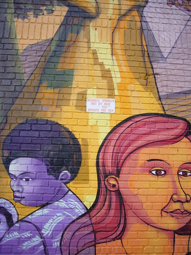
Graphics featured murals (not graffiti, which has been featured in many shows recently) and was interesting. But fascinating was Vergara's narrative, in words, accompanying the images. In just a few sentences, Vergara dissected Harlem's mural trends from the last 40 years: 1970s murals were "angrily condemning racism and slavery"; "depictions of deceased drug dealers and their victims were popular" in the 1980s and 1990s. "Today the facades of buildings in Harlem advertise such products as gin, beer, Old Navy clothing, BMW sport cars, sneakers, black TV shows or schools, and rappers." Vergara's conversation with a building superintendent is summarized on a label accompanying a photo of a MLK mural located behind garbage cans (Coincidentally,the two men talked on MLK Day). A recent ad for 50 Cent's Formula 50 water is accompanied by labels claiming that 50 Cent and P Diddy are Harlem's current figureheads.

The Religion section of the exhibition featured photos taken from 2007 through 2009; there were photographs of churches and people (in their Sunday finest). Vergara has done the church beat before (see How the Other Half Worships). "Although there are over 300 congregations in Harlem today, many of the smaller ones have closed or moved, and Harlem is no longer an incubator of struggling churches."

The photographs in Landmarks and Benchmarks were not my favorite of Vergara's work, but there were a lot of interesting Harlem factoids. Do you know what "Koch" windows are? Isn't the Mount Morris Fire Watchtower an interesting structure? Why has the building that housed the Renaissance Ballroom and Casino stayed shuttered since 1979? The photographic highlight was the cross formation of "security" photos, but stylistically, they were very different than the Vergara photos we know, and it was a bit of a turn-off.

The Obama and Sculpture sections were interesting, but the exhibition would not have lacked in their absence. The Heart of Harlem photographs were displayed in the center of the space and were nice street photography shots of electic Harlem residents.

Harlem, 1970-2009: Photographs by Camilo José Vergara displayed a broader style of Vergara's photography; in and of itself, this made the show thought-provoking. Aesthetically, it seemed a bit like a Vergara retrospective (without American Ruins, that is) with the cohesive subject matter of Harlem creating the bonds between different types of photographic works.

While I was in the exhibition space, a group of approximately a dozen sightseers entered the space; most were in their 20's, but a few were older. After about ten minutes of looking at photographs on one side of the room, the tour guide/leader of the group asked the then-seated-and-ignoring-the-show group "What do you want to do?" Several voices responded quickly: "Shopping!" The tour guide was disappointed. "Really?" he asked. After several minutes of conversation about future plans, one 20-something male said, "(Let's) Go to 125th Street." The group left shortly thereafter. Most likely, the group shopped and got to see billboards of 50 Cent and P Diddy. But they probably didn't see Vergara's Harlem, and that's kind of sad.

Image is Vergara's 65 East 125th Street (2007).